---
title: OctoPerf's new UI - Overview changes
url: https://blog.octoperf.com/octoperfs-new-ui---overview-changes/
date: '2022-06-13'
authors:
- gbetaillouloux
categories:
- Innovation
tags:
- User Experience
description: OctoPerf's new UI is in open beta stage. In this blog post we will cover all the major changes to the navigation and usability in general. Later posts on this blog will be dedicated to the specifics of design, runtime and analysis.
---

# OctoPerf's new UI - Overview changes

[Our new UI](https://api.octoperf.com/ui/) has been available for everyone since a few weeks now. It is a major project for us that has taken several years to get to this stage. It's been a lot of effort but we're confident that it will be worth it when you see all the new possibilities.

That being said, we thought it would be helpful to ease you into it by going through some of the key features together. The goal is to **talk about the major UI changes that impact most if not all the new screens**. Then we'll cover the specifics of each individual steps (like design or runtime) in later blog posts.

## Navigation

Of course the first thing that comes to mind is the navigation through OctoPerf. And we've made a lot of changes in this area. 

### Left-handed menu

<div style="display: flex; flex-direction: row; gap: 1rem;" markdown>
<div style="min-width: 6rem;">
    <img class="img-fluid" src="https://blog.octoperf.com/img/blog/octoperf-new-ui-overview/left-hand-menu.png" alt="Left hand menu" title="Left hand menu" style="zoom:60%;">
</div>
<div markdown>
    
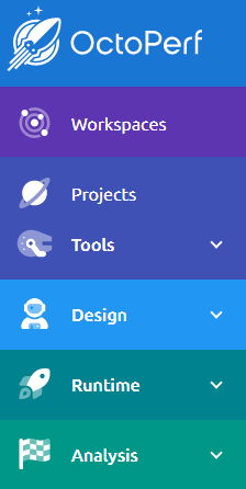
The top menu has become a left-handed menu now.
We've always been trying to keep up with properly adding the new features in the menus [like we did last year](https://blog.octoperf.com/octoperf-v12---scheduler-slack-integration-and-ui-upgrade/#improved-menus). But we thought it could be improved further. Typically, we noticed that new users struggled to notice what's inside the workspace menu so we decided to split it into another "Tools" submenu.

Workspace and projects remain visible at all times in order to navigate back to their level easily.
It can also be collapsed in order to save horizontal space once you are familiar with the layout and icons.
</div>
</div>
<p></p>


### Breadcrumbs

Another pain point we had to address was navigation to and from configuration pages. Menus like [Variables](https://api.octoperf.com/doc/design/edit-virtual-user/configuration/variables/), [Servers](https://api.octoperf.com/doc/design/edit-virtual-user/configuration/servers/), [Files](https://api.octoperf.com/doc/design/edit-virtual-user/configuration/files/) and others used to be [modal windows](https://en.wikipedia.org/wiki/Modal_window) and because of that could only be accessed from [the design page](https://api.octoperf.com/doc/design/edit-virtual-user/). 

We changed this last year in order to **highlight that they apply to the entire project and not just a single virtual user**. But since then, when opened from a virtual user, they made navigation more complex since you had to find your way back to your virtual user afterward. We quickly added buttons to navigate back but they were either small or sometimes displayed too low on the screen (you might have to scroll down to notice them):

<p style="text-align: center">
<img class="img-fluid" src="https://blog.octoperf.com/img/blog/octoperf-new-ui-overview/back.png" alt="Back" title="Back" style="zoom:70%;">
</p>

Instead, now we invite you to use the [Breadcrumbs menu](https://api.octoperf.com/doc/navigation/#breadcrumbs-menu), it's visible in the top part of the screen at all times wherever you are in OctoPerf:

![breadcrumbs](https://blog.octoperf.com/img/blog/octoperf-new-ui-overview/breadcrumbs.png)

As you dive into a project, the breadcrumbs menu keeps track of items of higher level items like the [Workspace](https://api.octoperf.com/doc/workspace/), [Project](https://api.octoperf.com/doc/project/) or even [Virtual user](https://api.octoperf.com/doc/design/edit-virtual-user/). This way you can navigate in a single click:

- The upper part leads you to the list of Workspaces/Projects/Design(Virtual users) in case you want to switch to another one,
- The lower allows you to edit the current Workspace/Project/Virtual user.

So if you're working on a new variable like in the screenshot above, simply click on 'Buyer' to get back to the virtual user edition screen.

## Themes and scaling

Our old UI was only available with a white background but you can now choose the background you prefer. The choice is available on your first login or from your [profile page](https://api.octoperf.com/doc/account/profile/#appearance):

![appearance](https://blog.octoperf.com/img/blog/octoperf-new-ui-overview/appearance.png)

You might prefer one or the other especially if you've already changed your browser's appearance.

### Zoom

You can also adjust the entire UI size using your browser's built-in zoom/unzoom feature. **Our new UI is fully compatible with any zoom level.** 

This also means that we fixed one of the major pain points since it will no longer be possible to lose the vertical index. It could happen when working on very large virtual users with a lot of content, especially when selecting several elements in a row. The new UI will be 100% consistent in that regard since it can be resized at any time using _CTRL+Mousewheel_.

## Modular interface

![modularity](https://blog.octoperf.com/img/blog/octoperf-new-ui-overview/modularity.png)

One of the main features of the new UI is the panels that you can open and collapse. They offer a number of improvements to the design screen:

1. **Customizable**: These allow you to work with a customized layout much like in an [IDE](https://en.wikipedia.org/wiki/Integrated_development_environment) like [Intellij](https://en.wikipedia.org/wiki/IntelliJ_IDEA) or [Eclipse](https://en.wikipedia.org/wiki/Eclipse_(software)). Except all these are heavy clients you have to install on your computer, whereas in OctoPerf you need nothing more than your standard web browser to access all these possibilities.
2. **Compact**: Another reason for this is that it allows ut to put all the options on the screen at once. It might be a lot to understand at first but they all come collapsed. And eventually it means less navigation is required to achieve the same objective. Especially when comparing requests contents, replayed virtual users, etc..
3. **Familiar**: As stated above developers are already familiar with IDEs. But we've also made sure to use a layout that will be familiar for testers as well. For example we've kept the Design/Runtime/Analyze structure. In the end this means a more familiar working environment for everyone.
4. **Comfortable**: Compared to our older UI, We've avoided popups and other menus that would print on top of the rest because sometimes they get in the way of your work. Here you can control everything that's on display.

## Build-in assistance

### Help

The help panel can be used to have contextual documentation on everything you're doing in OctoPerf. We even open it automatically on some key steps when the horizontal space allows it:

<p>
<img class="img-fluid" src="https://blog.octoperf.com/img/blog/octoperf-new-ui-overview/help.png" alt="help" title="Help" style="zoom:40%;">
</p>

It can also be opened in a new tab as usual but using this panel gets you contextual information very quickly.

Since we always work to keep the documentation up to date, feel free to browser through it if you have any question.

### Events

<div style="display: flex; flex-direction: row; gap: 1rem;">
    <div style="min-width: 9rem;">
        <img class="img-fluid" src="https://blog.octoperf.com/img/blog/octoperf-new-ui-overview/events.png" alt="Events" title="Events" style="zoom:50%;">
    </div>
    <div>
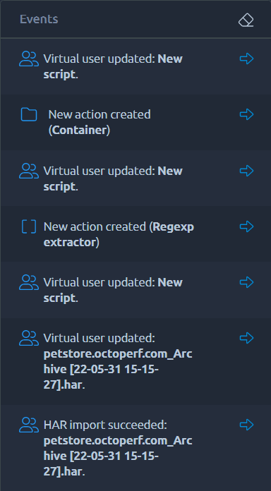
        The events panel can be used to display a log of events.<br>
        Not only will it remind you what are the last actions you've performed, but you can also use each entry to navigate to the related items.<br>
        Typically you can use it to reverse a previous change or simply double check for mistakes.<br>
        Because the log is only stored in your browser, be careful before refreshing the page or closing a tab since that will reset it.<br>
    </div>
</div>
<p></p>

## Lists

We've also taken this opportunity to create components that can be reused everywhere and that will have a behavior that is easy to indentify. For example everywhere there is a list you will find [the same possibilities](https://api.octoperf.com/doc/navigation/#lists).

![list-selection](https://blog.octoperf.com/img/blog/octoperf-new-ui-overview/list-selection.gif)

Lists usually allows you to select one or several elements and apply a number of actions to them, these actions can vary from editing the element, duplicating it or simply removing it. But depending on the context other actions can be available, like downloading one file from the [new files menu](https://api.octoperf.com/doc/design/edit-virtual-user/configuration/files/#files-list) or [removing unused servers](https://api.octoperf.com/doc/design/edit-virtual-user/configuration/servers/#delete-unused) from your project.

### Filters

By default, you can use the [search dialog](https://api.octoperf.com/doc/navigation/#simple-search) on top of the list to quickly filter its contents, but if you click on filters you can also [apply more accurate filters](https://api.octoperf.com/doc/navigation/#advanced-search). Those filters are contextual to each list, for instance filtering all [fragments](https://api.octoperf.com/doc/design/create-virtual-user/import-jmeter-jmx/#module-controllers) from the virtual user list.

## Conclusion

I hope you can now see all the improvements brought by our new UI. As a final word I would also like to highlight that **it's just the beginning for us**. Updating the UI to all the latest technologies will allow us to improve many things that were frustrating to us in the older one. But while we work on all the cool stuff, make sure to share your feedbacks. Those of you who participated in the closed beta will have noticed all the changes we've made. **This was only possible thanks to all the good AND bad feedbacks** we've had during that phase. And there's probably a lot more we can do, so **keep us posted on your experience !**