
Angular: How to Use Multiple Themes with Material?
This blog post is a tutorial on how to use multiple themes for an Angular11+ application with Material Design.
We start from scratch by creating a new project and configuring the themes. Then we add a sample Card component to see what the themes look like and create a button to switch between Light and Dark themes.
Finally, we discuss two solutions in order to apply a theme to the application body and to a custom component:
Prerequisites
The only prerequisite for this guide is to have installed Angular (version 11 or more) on your computer.
Check out the official Angular documentation to know how to install it.
Create a Project
So let's start by creating a new Angular project called material-themes by executing the command ng new material-themes in a terminal:
> ng new material-themes
? Do you want to enforce stricter type checking and stricter bundle budgets in the workspace?
  This setting helps improve maintainability and catch bugs ahead of time.
  For more information, see https://angular.io/strict Yes
? Would you like to add Angular routing? No
? Which stylesheet format would you like to use? SCSS   [ https://sass-lang.com/documentation/syntax#scss ]
CREATE material-themes/README.md (1023 bytes)
CREATE material-themes/.editorconfig (274 bytes)
CREATE material-themes/.gitignore (631 bytes)
CREATE material-themes/angular.json (3777 bytes)
CREATE material-themes/package.json (1205 bytes)
...
CREATE material-themes/e2e/src/app.po.ts (274 bytes)
✔ Packages installed successfully.
    Successfully initialized git.
Note:
You must select the SCSS option when asked Which stylesheet format would you like to use?.
This creates a sample Angular application without any dependency. Read the next section to install the Material Design components library.
Install Material Design
Still in a terminal, execute the command cd material-themes to get to the created project and then:
> ng add @angular/material
? Would you like to share anonymous usage data about this project with the Angular Team at
Google under Google’s Privacy Policy at https://policies.google.com/privacy? For more
details and how to change this setting, see https://angular.io/cli/analytics. No
Installing packages for tooling via npm.
Installed packages for tooling via npm.
? Choose a prebuilt theme name, or "custom" for a custom theme: Indigo/Pink        [ Preview: https://material.angular.io?theme=indigo-pink ]
? Set up global Angular Material typography styles? No
? Set up browser animations for Angular Material? Yes
UPDATE package.json (1271 bytes)
✔ Packages installed successfully.
UPDATE src/app/app.module.ts (423 bytes)
UPDATE angular.json (3979 bytes)
UPDATE src/index.html (494 bytes)
UPDATE src/styles.scss (181 bytes)
Several files are updated by this command, we will modify two of them later on:
- Angular being a Single-page Application, the src/index.html is the only HTML file served by a web server for the whole application. All subsequent visual pages are displayed using Javascript,
- The src/index.html file contains the global styles for our application. This is where we will define our themes.
Configure the Themes
Following the official Theming your Angular Material app documentation, we can update the src/styles.scss file to create two color themes:
@import '~@angular/material/theming';
@include mat-core();

$light-app-theme: mat-light-theme((
        color: (
                primary: mat-palette($mat-indigo),
                accent: mat-palette($mat-pink, A200, A100, A400),
                warn: mat-palette($mat-red),
        )
));

$dark-app-theme:   mat-dark-theme((
        color: (
                primary: mat-palette($mat-cyan),
                accent: mat-palette($mat-blue-gray, A200, A100, A400),
                warn: mat-palette($mat-amber),
        )
));

@include angular-material-theme($light-app-theme);

.dark-theme {
  @include angular-material-color($dark-app-theme);
}
Each theme is using its own set of primary/accent/warn colors.
- The
$light-app-themeis initialized with the SCSS functionmat-light-themeand will have dark font over white background, - On the contrary, the
$dark-app-theme-app-themeis initialized with the SCSS functionmat-mat-dark-theme-themeand will have light font over dark background, - The dark theme is applied to any component inside an HTML tag with the
dark-themeCSS class.
Components
To apply the dark theme to the whole application, the trick is to add the dark-theme class to the root <html> tag inside the src/index.html file.
But first let's add a sample component to our application so that we can see what our themes looks like.
Add a Sample Component
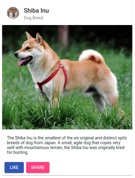
The easiest way to do it is to copy/paste an example Card component taken from the Material documentation examples (plus I love Shiba dogs!):
Update the src/app/app.component.html file to replace its default content by the Material card component:
<mat-card class="example-card">
  <mat-card-header>
    <div mat-card-avatar class="example-header-image"></div>
    <mat-card-title>Shiba Inu</mat-card-title>
    <mat-card-subtitle>Dog Breed</mat-card-subtitle>
  </mat-card-header>
  <img mat-card-image src="https://material.angular.io/assets/img/examples/shiba2.jpg" alt="Photo of a Shiba Inu">
  <mat-card-content>
    <p>
      The Shiba Inu is the smallest of the six original and distinct spitz breeds of dog from Japan.
      A small, agile dog that copes very well with mountainous terrain, the Shiba Inu was originally
      bred for hunting.
    </p>
  </mat-card-content>
  <mat-card-actions>
    <button mat-raised-button  color="primary">LIKE</button>
    <button mat-raised-button color="accent">SHARE</button>
  </mat-card-actions>
</mat-card>
Don't forget to also update the src/app/app.component.scss styles file:
.example-card {
  max-width: 400px;
}

.example-header-image {
  background-image: url('https://material.angular.io/assets/img/examples/shiba1.jpg');
  background-size: cover;
}
And more importantly to add MatCardModule and MatButtonModule modules to the application module imports (src/app/app.module.ts):
@NgModule({
  declarations: [
    AppComponent
  ],
  imports: [
    BrowserModule,
    BrowserAnimationsModule,
    MatCardModule,
    MatButtonModule,
  ],
  providers: [],
  bootstrap: [AppComponent]
})
export class AppModule {
}
Time to check the result: type the command ng serve --open in your terminal.
The application should automatically open in your preferred web browser and display the following content:
Programmatically Switch to Dark Theme
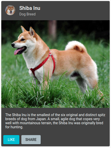
To check what it looks like in dark mode simply update the src/index.html file to set the dark-theme class on the html tag:
<!doctype html>
<html lang="en" class="dark-theme">
...
</html>
The application should now display the card component with a darkish background:
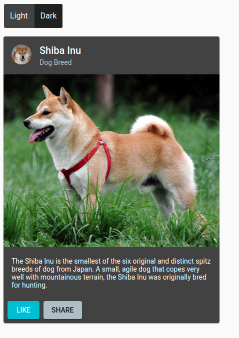
Create a Theme Switching Button
The theme selection should be up to the user though. Start by reverting the previous modifications to the src/index.html file in order to use the light theme by default.
Then create a theme-switch component to allow the dynamic theme selection with the command ng generate component theme-switch.
> ng generate component theme-switch
CREATE src/app/theme-switch/theme-switch.component.scss (0 bytes)
CREATE src/app/theme-switch/theme-switch.component.html (27 bytes)
CREATE src/app/theme-switch/theme-switch.component.spec.ts (662 bytes)
CREATE src/app/theme-switch/theme-switch.component.ts (299 bytes)
UPDATE src/app/app.module.ts (672 bytes)
This component is a toggle button that sets/removes the dark-theme on the root html tag when clicked.
Update the file src/app/theme-switch/theme-switch.component.html to:
<mat-button-toggle-group name="theme" aria-label="Theme Selection" [value]="theme">
    <mat-button-toggle value="light" (click)="selectLightTheme()">Light</mat-button-toggle>
    <mat-button-toggle value="dark" (click)="selectDarkTheme()">Dark</mat-button-toggle>
</mat-button-toggle-group>
Update the file src/app/theme-switch/theme-switch.component.ts to:
import {Component, Inject} from '@angular/core';
import {DOCUMENT} from '@angular/common';

@Component({
    selector: 'app-theme-switch',
    templateUrl: './theme-switch.component.html',
    styleUrls: ['./theme-switch.component.scss']
})
export class ThemeSwitchComponent {

    private static readonly DARK_THEME_CLASS = 'dark-theme';
    private static readonly DARK_THEME_LIGHT = 'light';
    private static readonly DARK_THEME_DARK = 'dark';

    public theme: string;

    constructor(@Inject(DOCUMENT) private document: Document) {
        this.theme = this.document.documentElement.classList.contains(ThemeSwitchComponent.DARK_THEME_CLASS) ? ThemeSwitchComponent.DARK_THEME_DARK : ThemeSwitchComponent.DARK_THEME_LIGHT;
    }

    public selectDarkTheme(): void {
        this.document.documentElement.classList.add(ThemeSwitchComponent.DARK_THEME_CLASS);
        this.theme = ThemeSwitchComponent.DARK_THEME_DARK;
    }

    public selectLightTheme(): void {
        this.document.documentElement.classList.remove(ThemeSwitchComponent.DARK_THEME_CLASS);
        this.theme = ThemeSwitchComponent.DARK_THEME_LIGHT;
    }
}
<html> element is retrieved by accessing the document.documentElement field.
Then, adding or removing the dark-theme CSS class is simply done by using the classList property.
Notes:
Don't forget to add the MatButtonToggleModule module to the src/app/app.module.ts file imports.
You also need to update the src/app/app.component.html file to include the created theme-switch component:
<app-theme-switch></app-theme-switch>.
Open the web application and click on the theme switch button to select the dark/light mode:
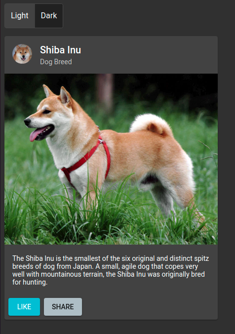
There is one issue though: the background remains white when switching to the dark theme! Let's fix this using SCSS Mixins!
Theming the Application Using SCSS Mixins
Using SCSS Mixins is the recommended way to apply themes to your application in the Material documentation.
Theming the App Background
Update the src/styles.scss file to:
- Create a body-theme mixin,
- Use it both in the default light theme and the dark one.
@import '~@angular/material/theming';

...

@mixin body-theme($theme) {
  $_background: map-get($theme, background);
  $app-background-color: mat-color($_background, background);

  body {
    background-color: $app-background-color;
  }
}

@include angular-material-theme($light-app-theme);
@include body-theme($light-app-theme);

.dark-theme {
  @include angular-material-color($dark-app-theme);
  @include body-theme($dark-app-theme);
}
The body-theme mixin gets the default application background color from the given $theme parameter by using the mat-get and mat-color functions imported from the material library.
The application in dark mode should now display a dark background as well as a dark card component:
Theming your Own Component
In this section we see how to apply theme colors to one of our own component.
Create the Component
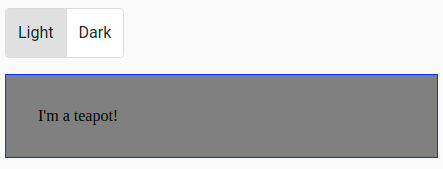
Of course the first step is to create a component of our own. Here a dummy teapot component that displays "I'm a teapot!" in a bordered panel.
Generate it using the following command:
> ng generate component teapot
CREATE src/app/teapot/teapot.component.scss (0 bytes)
CREATE src/app/teapot/teapot.component.html (21 bytes)
CREATE src/app/teapot/teapot.component.spec.ts (626 bytes)
CREATE src/app/teapot/teapot.component.ts (276 bytes)
UPDATE src/app/app.module.ts (878 bytes)
Update the src/app/teapot/teapot.component.html file:
<p>I'm a teapot!</p>
As well as the src/app/teapot/teapot.component.scss one:
p {
  margin-bottom: 1rem;
  padding: 2rem;
  display: block;
  border: 1px solid blue;
  background-color: grey;
}
Finally, update the App component html to include our component (src/app/app.component.html):
<app-theme-switch></app-theme-switch>

<app-teapot></app-teapot>
The application should look like this:
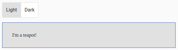
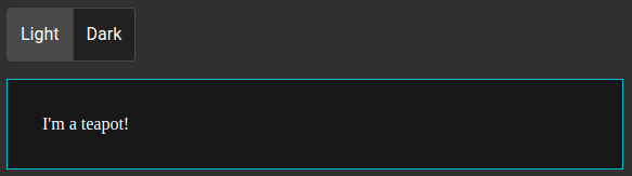
Create a Theme Mixin
Time to apply color theming to this newly created component using SCSS mixin!
First strip the file src/app/teapot/teapot.component.scss of color related styles:
p {
  margin-bottom: 1rem;
  padding: 2rem;
  display: block;
}
// Teapot Theming
@mixin teapot-theme($theme) {
  $_background: map-get($theme, background);
  $_foreground: map-get($theme, foreground);
  $background-color: mat-color($_background, background);
  $foreground-color: mat-color($_foreground, text);
  $primary: map-get($theme, primary);
  p.teapot {
    border: 1px solid mat-color($primary);
    background-color: darken($background-color, 10%);
    color: $foreground-color;
  }
}
The border now uses the primary color of the current theme. The text is displayed using the theme foreground color, and the background matches the theme's.
You should also update the default and dark themes to include this mixin:
@include angular-material-theme($light-app-theme);
@include body-theme($light-app-theme);
@include teapot-theme($light-app-theme);

.dark-theme {
  @include angular-material-color($dark-app-theme);
  @include body-theme($dark-app-theme);
  @include teapot-theme($dark-app-theme);
}
Reopen the application: switching from light to dark theme should update the teapot component accordingly:
Theming the Application Using CSS Variables
IMO using SCSS mixins is not ideal to handle multiple custom Material themes!
Theming Choice Considerations
First you have all your theme related styles in a single src/styles.scss file. It can become quite big if you have many custom components. The other solution is to split this file in several smaller files, for example:
- A material-variables.scss file that imports the material theming functions (
@import '~@angular/material/theming';) and declare the two themes ($light-app-theme: mat-light-theme(...) $dark-app-theme: mat-dark-theme(...)), - A material-themes.scss file that includes the mat-core with
@include mat-core();and includes the theme styles for both the light and dark mode, - An app.scss that imports the material-themes.scss file (this must be done only once in the whole application) and declares other custom global themes.
Then, each custom component that needs to get color values from the Material theme can include the material-variables.scss file and create the theme mixin here. This is harder to set up though.
And you still have to get colors from the given theme for every custom component! This is tedious and creates many repetitions in your styles.
A Single Mixin that Declares CSS Variables
The idea is to have a single mixin dedicated to theme colors that initialize CSS3 variables. CSS variables are also known as custom properties or cascading variables.
So let's update the src/styles.scss file to create it:
@import '~@angular/material/theming';

@include mat-core();

...

@mixin theme-colors($theme) {
  $_background: map-get($theme, background);
  $_foreground: map-get($theme, foreground);
  $_primary: map-get($theme, primary);
  $background-color: mat-color($_background, background);
  $foreground-color: mat-color($_foreground, text);
  $primary-color: mat-color($_primary);
  --app-background-color: #{$background-color};
  --app-background-dark-color: #{darken($background-color, 10%)};
  --app-foreground-color: #{$foreground-color};
  --app-primary-color: #{$primary-color};
}
Here, the theme-colors mixin is created:
- It fetches the various colors from the Material theme using map-get and mat-color functions,
- It initializes several CSS variables with the syntax
--my-var: value: - The value is set using String interpolation (The
#{...}around the value), otherwise the SCSS variable name is written in the variable instead of its value, - The darken SCSS function is used to create a darker shade of the theme background.
This mixin is used a usual in the default light theme as well as in the dark one if the CSS class dark-theme is set:
:root {
  @include angular-material-color($light-app-theme);
  @include theme-colors($light-app-theme);
}

.dark-theme {
  @include angular-material-color($dark-app-theme);
  @include theme-colors($dark-app-theme);
}
Note:
Here we use the
:rootsyntax. It is a CSS pseudo-class that matches the root element of a tree representing the document (The<html>element in our case).
Theming the Body Background Color
The body background color now uses the previously created CSS variable with the syntax var(--my-var):
body {
  background-color: var(--app-background-color);
}
Theming our Custom Component
You can also update the style of the teapot component (src/app/teapot/teapot.component.scss) to use these variables:
p {
  margin-bottom: 1rem;
  padding: 2rem;
  display: block;
  border: 1px solid var(--app-primary-color);
  background-color: var(--app-background-dark-color);
  color: var(--app-foreground-color);
}
The big advantage is that all the style for this component is now located in a single file, making it easier to maintain. Also, the variable values are only fetched from the theme once.
There are a few drawbacks to this approach though:
- You must declare all values in the mixin: for instance it is not possible to do
darken(var(--app-background-color), 10%)as darken is an SCSS function executed when the files are compiled to CSS, - It can be hard to distinguish SCSS variables (compiled: their value is fixed during runtime) from CSS variables (that can be updated at runtime and are evaluated by the web browser).
- I don't know in what proportions but the CSS variables have an impact on performances when the browser renders your application.
Conclusion
Sources:
The source code for this guide is available on GitHub at material-themes CSS variables for the version that uses CSS variables.
The version based on SCSS mixins is available at material-themes mixins.
So what's your opinion regarding multiple themes usage in an Angular application? Would you rather use SCSS mixins or CSS variables? A mix of both maybe?