How we greatly improved user engagement
The goal of any Saas Application is to convert as many trials as possible to paid customers. To improve your application, what do you absolutely need? Feedback. We are using a live chat support app to get feedback on how users are using our SaaS app.
We were greatly surprised by the results. Many of our users were stuck at the very first step of load testing their web or mobile app. We discovered several issues:
- Customers were proposed to create an empty virtual user as first choice. Many of them were then stuck with this empty user, not knowing what to do next,
- Customers were not finding how to return to project homepage from the virtual users edition page,
- We are only collecting email when user are registering to improve visitor to trial conversion rate. We have then a lack of information about users, and need to find a way to get them later.
Let me explain now how we greatly improved our user engagement and trial conversion rate by fixing the above points.
Customer Information

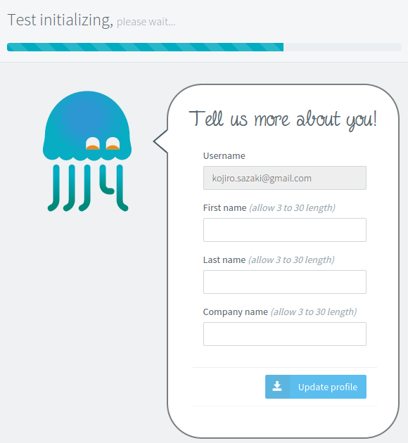
We found a nice trick to get customer information and improve user experience. While the test is launching on our load testing platform, the user has to wait. It's a great opportunity to both collect user information and use this wait time efficiently.
Going back to the project
We thought that it would be known to everyone that clicking one the OctoPerf logo would bring back to the home page. Every website works like this. But we were wrong, most of our users were having a hard time navigating in the different views (Project, Virtual Users, Scenarios and Test Reports).
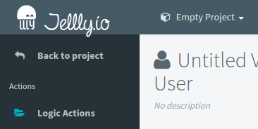
So we simply added a Back to project link under the logo (In OctoPerf the home page is dedicated to the project):

We could also add a mega menu to navigate to all virtual users, scenarios and reports of the current project. But, we didn't want to have several ways to do the same things in our app.
Validating and launching a virtual user
It's important to validate the behavior of a virtual user before running the load test. Indeed, some request could fail, and it's better to know it before letting go thousands of simulated users on your servers.
The Validate Virtual User button was placed in the aside menu. Not a bright spot. We moved it to the top of the page, and made it bigger.

We also added a progress indicator on each validation icon. These loading icons become a colored dot when the validation is done:
- A green dot if it succeed.
- A yellow got for containers whose some of the children have failed.
- A red indicator for failed actions.

Last point, we also added a Create Scenario button next to the validation one. Clicking on it creates a default scenario that uses the current virtual user for its configuration. It makes the transition from virtual user to scenario easier.
Drag and drop
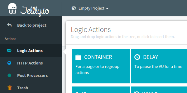
We started with a Drag And Drop only solution for OctoPerf. So the only way to add actions to a virtual user (or devices to a scenario, or charts to a test report) was to drag them from the menu, and drop them in the tree. We have seen that many users were struggling using drag'n'drop. It's pretty hard, in fact, to anticipate how newcomers will handle our tool. And we really want to give them the best possible experience.
Adding an action
So, now you can also insert an action in one simple click. If there is a selected action in the tree, the new one will be added in or after it, depending whether it's a container or not. If there is no action selected in the virtual user tree, the new action is appended to it, at the end.
You can also do the same in Scenario and in load test reports.
Moving an action
Our users could have the same trouble when moving actions in the tree. So we added buttons to move them in one click.
Keyboard shortcuts are also available. Select an action and:
- type CTRL + UP to move it up,
- type CTRL + DOWN to move it down,
- type CTRL + LEFT to dedent it,
- type CTRL + RIGHT to indent it.
UP and DOWN keys change the currently selected action. LEFT and RIGHT keys expand or collapse it (it must have children actions).
And finally the SUPPR key removes the selected action.
Feedback is the key
By changing those small points, we have immediately seen a great result with our next trial customers. We went from 75% of the users leaving the app without doing anything to as low as 20%. There is still some headroom for improvement. Feedback is the key. It's not possible to design the perfect Saas application on the first try. You should have a way to get customer feedback to improve yourself, or your business may never take off properly.
