How we tripled our conversion rate?
OctoPerf is a SaaS load testing solution.
A load test simulates a number of predefined virtual users, to validate the application for an expected load of concurrent users. Applications tested range from company intranets to e-commerce websites. This type of test makes it possible to highlight the sensitive and critical points of a technical architecture. It also allows measuring the impact on the servers, the bandwidth required on the network, etc.
Graphical Debt
A load test campaign is usually divided in three steps:
- Designing the behavior of the simulated virtual users on the application under test,
- Configuring the runtime scenario properties (number of concurrent visitors, locations, browser and network used, etc.),
- Analysing the test results to pinpoint potential performance bottlenecks.
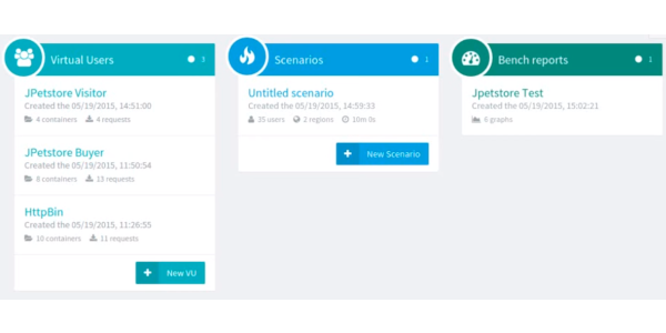
When we released the first version of OctoPerf back in 2015 it had far less features than it has today. The GUI was pretty simple and displayed these three steps in a single page, making it obvious for load testers that they had to go from design to runtime to analysis.
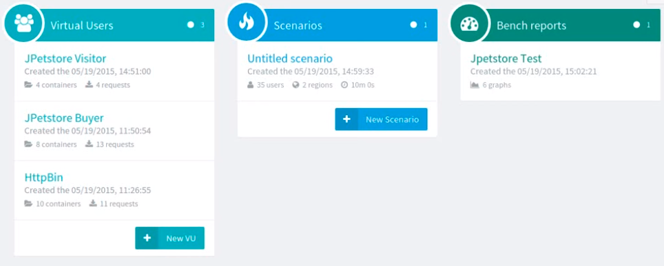
As the application evolved we added many features such as different ways to import virtual user scripts, application and server monitoring, tests reports comparison, collaboration workspaces, etc.
Just like legacy code requires refactoring when we add new features, we came to a point where our GUI needed to be rethinked.
So, we spent 6 months using Hotjar to check:
- How first time visitors were using our load testing platform,
- How far in the load testing process they were going,
- What could be done to offer a smoother user experience.
This iterative process allowed us to triple our conversion rate from visitors to paying customers.
Keep on reading if you want to find out what we changed to greatly improve the first user experience in OctoPerf!
Reflect Application Logic Path In The Menu
In order to keep the simplicity of our GUI, we had to split it in 4 different sections:
- Design
- Monitoring
- Runtime
- Analysis
So we added the following navigation menu on top of the application to give our users a quick access to each section:

First, the Monitoring section is reserved for experienced load testers. Even though a direct access from the top menu is good for them, it confused newcomers.
As I said before, a load test is usually divided in three sequential steps. This top menu gives quick access to each step but they are not ordered anymore.
We modified the navigation menu to this:

The addition of arrow shapes shows in what order to conduct a load test. Also, a choice was made to move the Monitoring section to a sub-menu, priority made on the user experience of first time visitors over the more experienced ones.
Virtual user creation wizard
Over the years we added several ways to generate Virtual Users in OctoPerf. The Virtual User creation wizard displayed all these possibilities right from the first step:
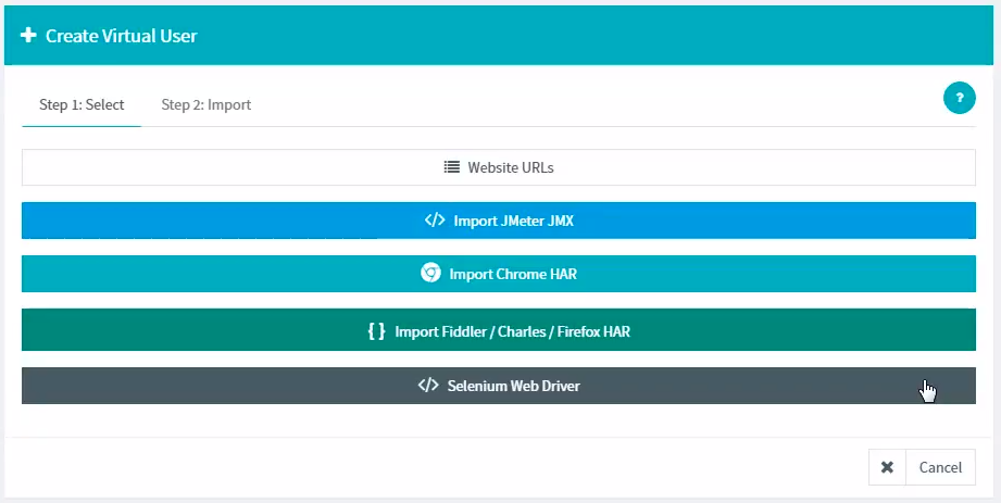
Five options to choose from is too many! Moreover, some buttons regroup several use cases (HAR imports and URL selection), making it even more confusing for our users.
For simplicity, we identified 3 user profiles:
- People that only want to make simple load tests, whether it be by calling a website URL or a REST API.
- Advanced users that wish to create dynamic load testing scenarios by importing HTTP Archives (HAR).
- JMeter users that would upload their existing projects (JMX files) on OctoPerf.
So, the first step of the wizard only shows these options:
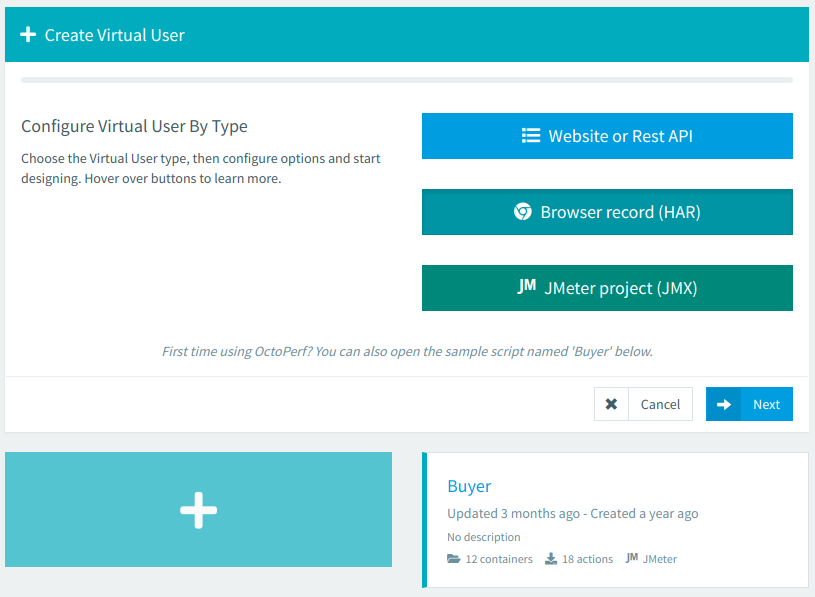
We also added a second step to this wizard. It lets our users select more precisely what they want to achieve:
- Website hammering, REST API load test or Selenium script?
- Import an HAR file from a browser (Chrome or Firefox?) or a recorder (Fiddler or Charles?).
- Etc.
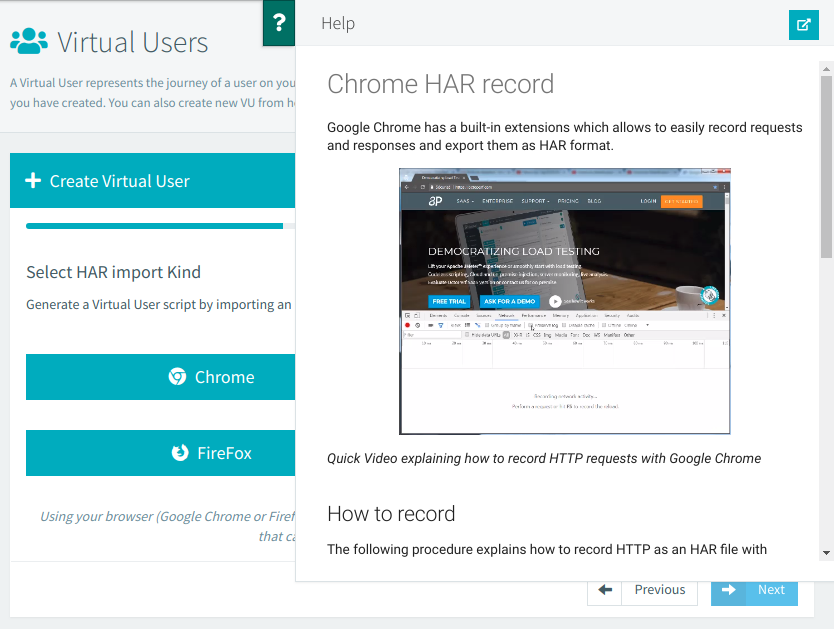
Splitting the choices in two steps not only makes it easier for the user, but it also allows us to display the contextual help relative to what he selects. For example if a user wants to import an HAR and is using a Chrome browser, we can display the help to let him know how to generate an HTTP Archive.
Notes: We also improved our users experience regarding virtual user creation with 2 non visual modifications:
- A default project is created, it contains a "Sample" virtual user. Users that have no particular project in mind and just want to have a quick overview of OctoPerf can use it to check what the application is capable of.
- JMeter is an Open-Source load testing application that comes with several plugins. We automatically import them in OctoPerf when a user uploads a JMeter JMX project.
Next Step buttons
Once our load testers have designed a Virtual User, they probably want to configure and run their test.
We added a button to quickly create a Runtime Scenario from the design page, but only the button icon is visible by default. The button label expands on mouse-over. This behavior is common to all buttons placed on the top right corner of the application.
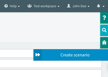
Only one last thing was missing: a visual incentive to make our users hover these buttons. So we simply expanded the button's label when the Design page is opened, slowly closing it to remind our visitors of the functionality.
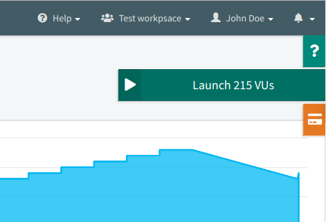
We applied the same strategy on the next page. During the configuration of a load testing scenario, we want to help our users to see where to click in order to launch the test.
Load test launching wizard
We're almost there! All we need now is our users to start a load test. OctoPerf then displays a nice report. The visitor has seen most of OctoPerf's capabilities if he reaches this point.
Another wizard guides the load tester. The first step is to validate all Virtual Users used in the current Scenario. It prevents from starting a test with bugged or non-functional VUs. The magnifier icons are links to the VU.
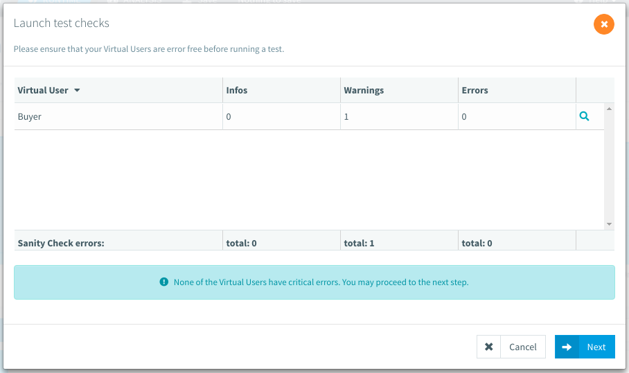
Then we display the used subscription and any potential mismatch in capacity.
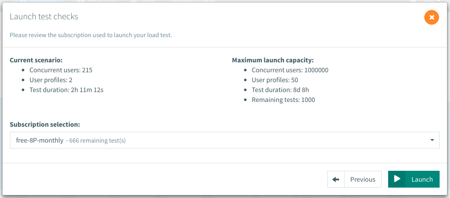
Other steps may appear only if the user is doing server Monitoring or using a report template. To check if every monitoring connection works or to select the template before launching the load test.
Conclusion
To conclude, we tripled our conversion rate from visitors to paying customers by:
- Defining a clear path to conduct a load test,
- Reducing the available choices to a maximum of 3 options,
- Guiding the users with Wizards, contextual help and tooltips.
The result is that a new visitor can discover OctoPerf in less than 10 minutes.
Another way to help ours users run meaningful load tests is through our tutorials. On the occasion of this GUI refactoring, we also recorded a new set of very informative videos on OctoPerf's usage.
