
New Load Testing Reports features
Why improving our reporting system? We were aware that some features were missing to make it easier to drill-down to bottlenecks. But, we prioritized those features low at the moment because we were focused on gaining traction for now.
If you have read How we greatly improved User Engagement, you know that we care about our customer needs. We carefully collect and prioritize customer feedbacks. And, at some point, we decided to get back to development to make some major improvements, based on what our customers experienced with our tool.
It's a matter of good balance between gaining traction to get new clients and improving the tool to avoid loosing leads. If people try your tool, it's already 50% of the work done. But, the other 50% are important too: our tool must solve our customer issues, and it must do it well.
We decided it was the moment to switch back to development because we were loosing some leads due to important features being missing. Let's take the tour!
Detailed errors
Before this improvement, you were seeing errors during your load test but could not figure out what was happening on server-side. We've made a major improvement there by introducing the Errors Table.

It shows every single error that happened during the load test with detailed information about each. By clicking on the Magnifier icon next to an error, you will have even more information about the error.

Understanding the root cause of an error has never been so easy. We feel like it's a major improvement to be able to see the played request and the received server response when an error occurs.

Like most report items, the errors table can be filtered by:
- Region: view errors happening in the selected region only,
- Virtual User, Container or request: drill-down to errors with request granularity.
Overall Statistics
The results table provides test wide statistics for the selected requests or containers.

Entries in the table can be sorted by any column. This table is great to have a quick overview of all performance metrics. What makes this table even more interesting is that you can specify the statistic columns you want.

The results table can be fully customized:
- Select only the metrics you want (Response Time, Connect Time etc.),
- Filter entries by type (Request or Container),
- Filter entries by Region, Virtual User or even request.
Like other reporting items, the results are updated live during the load test.
Need to export the table results to Excel? Try our built-in export tool: export the content as a CSV file in one click.

Percentiles Chart
Percentiles chart is probably one of the most wanted feature, like explained on Wikipedia:
A percentile (or a centile) is a measure used in statistics indicating the value below which a given percentage of observations in a group of observations fall. For example, the 20th percentile is the value (or score) below which 20 percent of the observations may be found.

For example, in the screenshot above, 85% of response times are below 1.5 seconds, and 95% of response times are below 3 seconds. This chart is great to take abnormal values out of the equation. Spikes in response happen during load tests and they can now be filtered using this chart.
The percentiles chart can be fully customized:
- Add up to 4 percentiles on the same chart,
- Select the metric to draw like Min, Avg, Max Response time, Connect Time, Latency and more,
- Filter by Region, Virtual User or even specific request.

Filtering is highly useful to isolate the bottlenecks per region, virtual user or request.
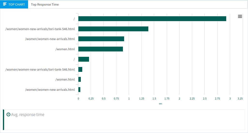
Top chart lisibility
To improve the top chart readability, we moved the labels on the left. Previously, the labels were below each bar. Labels have also been truncated to the request path only, making them more concise.
Export Charts
Charts can now be exported by clicking on the small button in the top right corner. Export charts as:
- PNG, JPG or SVG image,
- printable or PDF document.
This makes them easy to integrate into external reports like Word or Powerpoint.

Dynamic resources in results
As you may have already noticed, requests can be configured to download resources automatically. This feature is not new, but we improved the statistics provided in test results for these dynamic resources.

How does it work? When enabling this option on a request whose response is an HTML page, all CSS, images and javascript are downloaded dynamically by JMeter. JMeter parses the content of the response to find them, and downloads them like a real browser would do.
The reports now provide separate statistics and errors for these dynamic resources. It's easier to understand that some errors happening during the test are due to dynamic resources.
Customize your test report
You can drop as many report item in your load testing report as you want, in the order you want. Need several percentiles charts? No problem! Create the test report that suits your needs. We believe that a load testing tool should provide a freely customizable analysis report.

Thanks to customer feedback
We would have never improved reporting that much without customer feedback. Feedback is the key to understand what's wrong with your app. It gives the direction where to go. Of course, every customer feedback has not the same weight. Some features are more important than others, and the amount of people willing a feature is a good criteria on how to prioritize them.
We would like to thank the people who helped us to improve the reporting system. we hope you enjoy using OctoPerf as much as we enjoy making it better day after day!