OctoPerf v14.4.1 - Playwright, JMES Path and improved reporting
Summary
OctoPerf v14.4.1 introduces Playwright-based real browser testing, JMESPath extraction, and multiple UX and reporting upgrades.
- Playwright integration enables realistic browser journeys, with code editing, debugging traces, and detailed step-level analysis.
- JMESPath extractors make JSON manipulation easier thanks to a guided expression builder.
- Navigation has been simplified with clearer pathways across Design → Runtime → Analysis.
- Validation is more robust with stronger warnings, comparison modes, and improved debugging tools.
- Reporting benefits from saved layouts, persistent filters, enhanced templates, and multi-term filtering options.
Table of Contents
- Introduction
- Playwright
- JMESPath extractor
- Better navigation
- Improved validation
- Reporting features
- Full changelog
Introduction
OctoPerf v14.4.1 is out, which the perfect occasion to list the features highlights from these last months. You might have already noticed some of those features in OctoPerf a while ago, but we wanted to improve them until they are on par with our quality requirements before releasing them.
Playwright

First of all, if you don't know what Playwright is, I strongly suggest you follow our introductory tutorials on this blog. This series of articles will walk you through all you need to know in order to get started.
Now to summarize, Playwright is used as a real browser emulator that can be run within OctoPerf. There's a variety of use cases for this:
- Emulate a single real browser during a load test in order to measure impacts from client side,
- Run real browsers against an application that is too complex to script with JMeter,
- Quickly emulate low load scenarios with a few low-maintenance real browsers scripts.
The main drawback of Playwright load tests is that the hardware requirements are much higher than JMeter users. We enabled 1 Playwright user for each 200 JMeter users in every existing license. You will need to get in touch with our sales team to increase your limit if you want to run more Playwright users.
But following our usual policy, this feature has been enabled for everyone. Just select the Playwright option when you create a new virtual user.
Design
When you work on a Playwright action from our design screen, you will have access to a code editor:
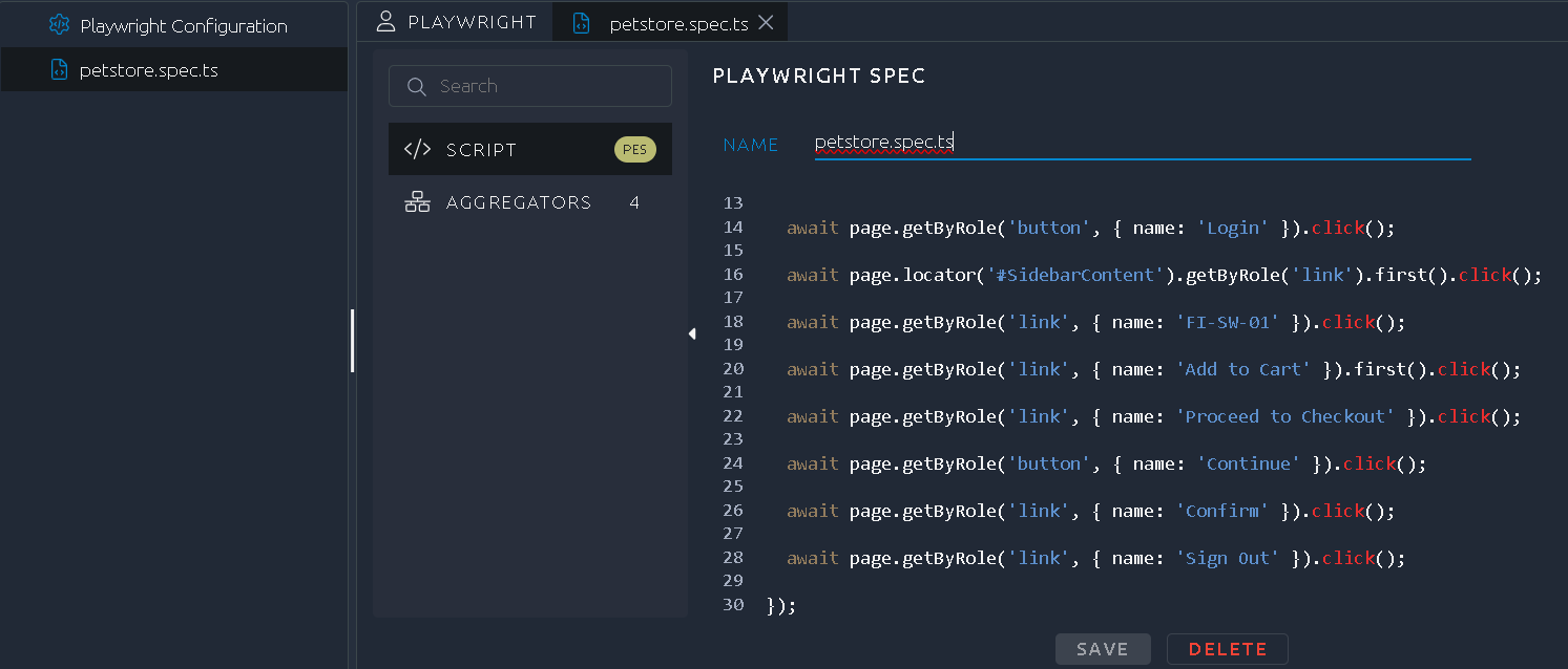
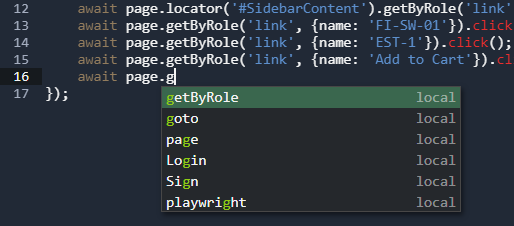
That said, it is not just a text field, it also provides auto completion and syntax highlighting:
Debug
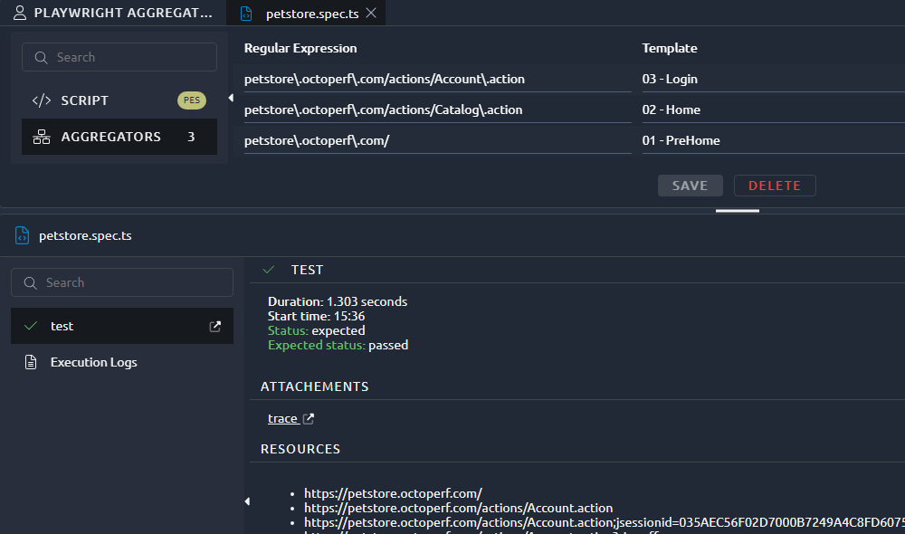
Once you run a virtual user validation you will be able to have a link to the Playwright Trace in order to debug step by step:
Analysis
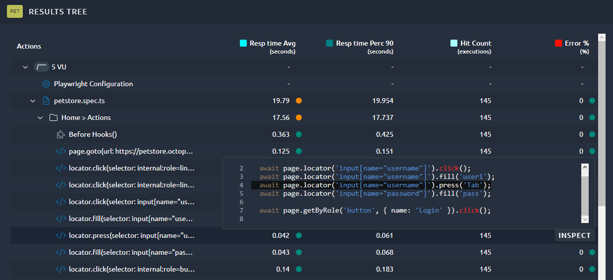
The analysis screen is mostly the same but you'll notice a huge difference in the results tree, we adapted it to the playwright model in order to show response times step by step:
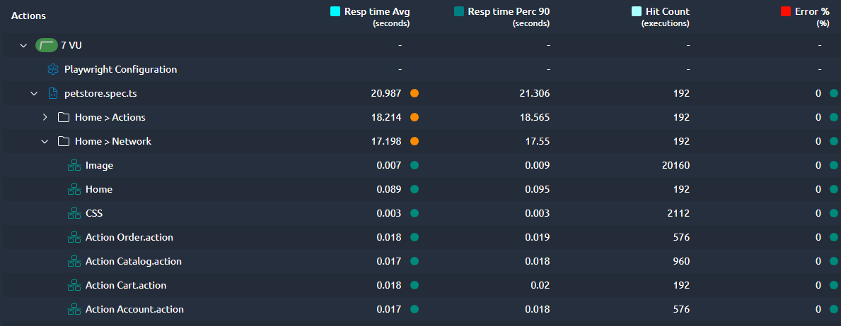
And if you prefer to group several steps, you can use our URL aggregators in order to have summary that is more readable:
JMESPath extractor
We already had the JSONPath extractor from JMeter in OctoPerf but JMESPath is also an interesting option that we wanted to add.
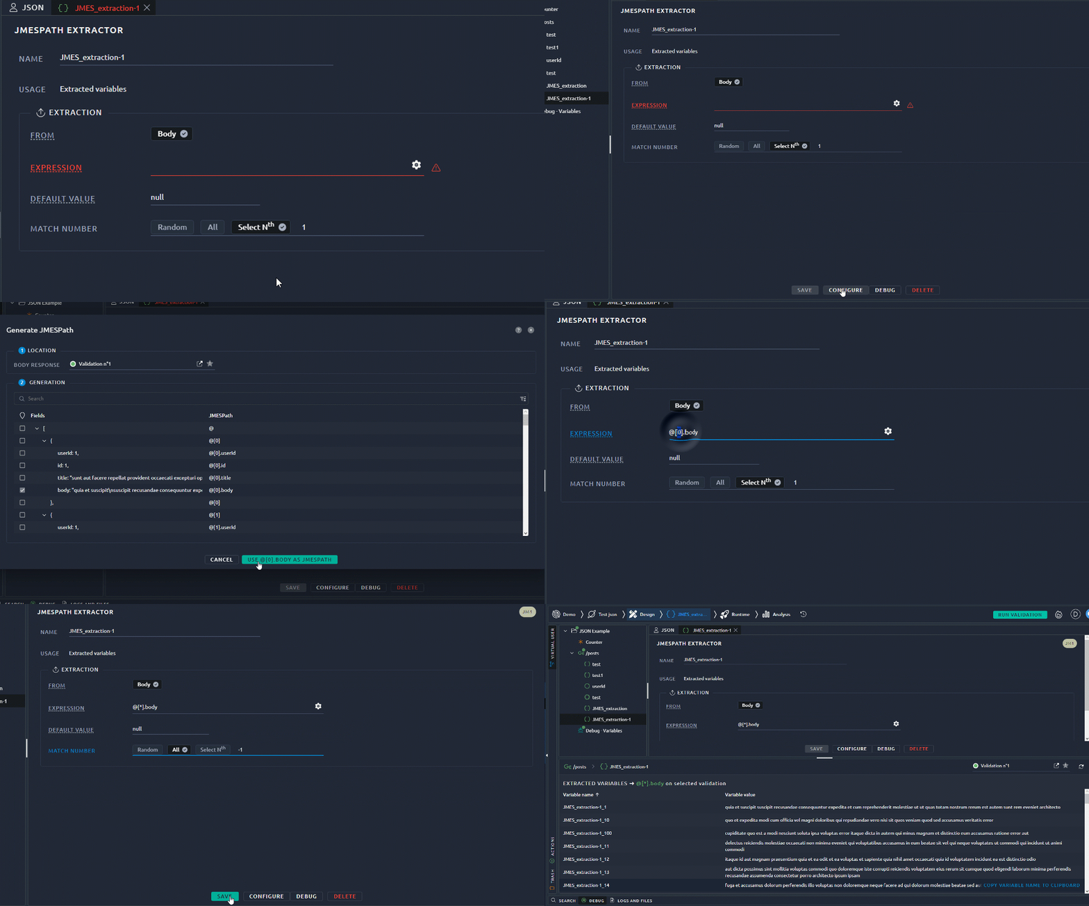
Of course when we add a JMeter extractor into OctoPerf, it always comes with an expression builder that requires zero prior knowledge of JMESPath:
Better navigation
Since we migrated to our new UI, navigation appeared confusing to new and regular users. It was becoming hard to convey how you progress through the typical Design, Runtime and Analysis steps.
Navigation
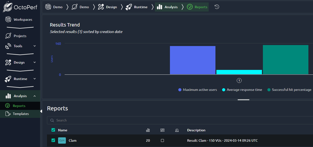
First we've changed the colors to only highlight the currently opened section and we added arrows to indicate the progression through the typical steps. This was done on the left handed menu and also breadcrumbs:
Action buttons
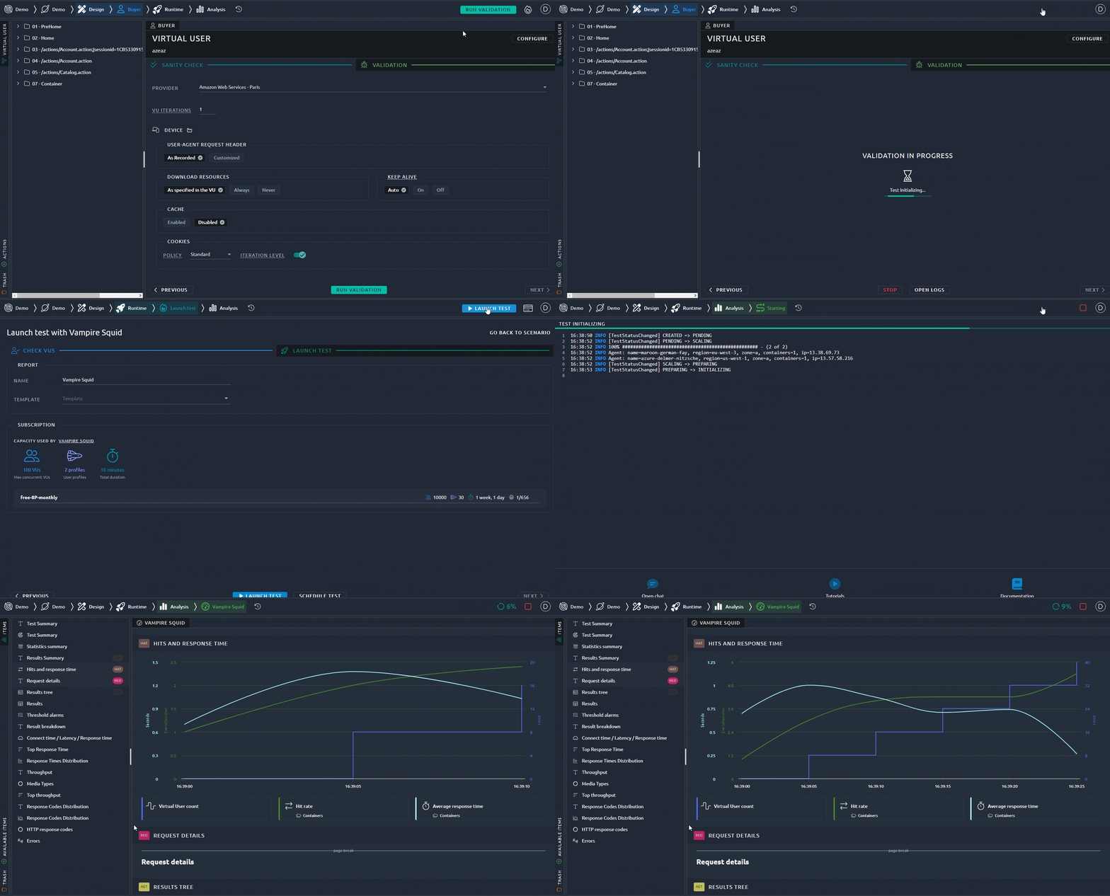
Another step was to incite you to click on validation from inside the design and then make it into a runtime button once the validation is over. If you just keep clicking on this button, it will execute the validation, open a runtime, execute a test and and show you the report. This makes it the single stop to go through a simple project:
Improved validation
Warning
The virtual user validation is a key aspect of OctoPerf. We strongly believe that it should be a mandatory step before a real test.
To further enforce this we've added several messages and warnings to take you back to the design and run a validation if you haven't:

You can of course still proceed with the test if you know that your virtual users work fine, but at least new users get an additional chance to debug their test scripts.
Side by side comparison
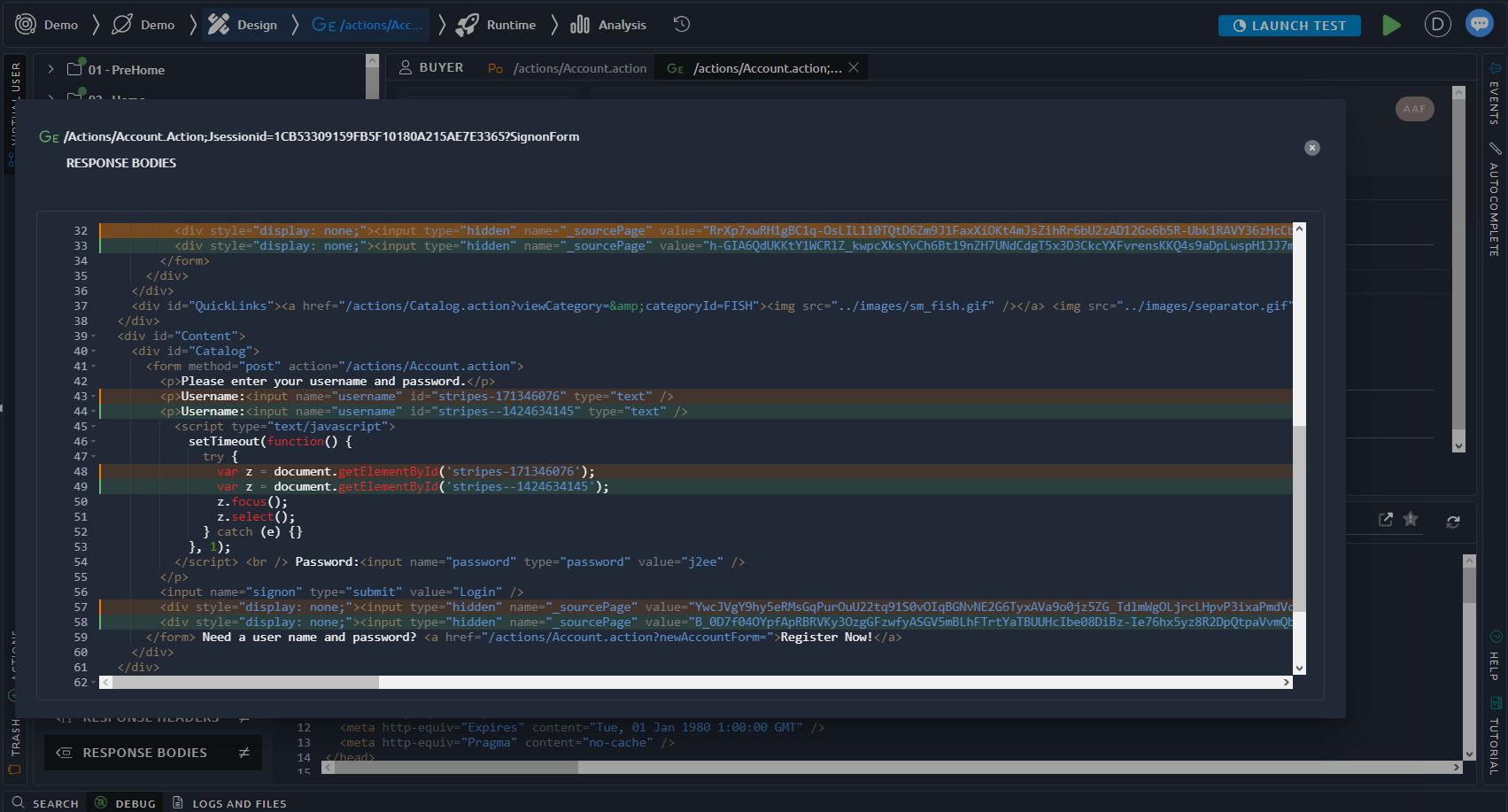
The side-by-side comparison of the design debug panel was one of the killer features of the old OctoPerf UI. We tried to reproduce the same with latest angular versions but struggled to find a proper way to do it so far. This is now fixed with our latest version:

If you prefer the inline comparison, you can switch using the mouseover menu:

And since this panel can be small, we also added another button to temporarily go fullscreen:
Reporting features
Report layout saved
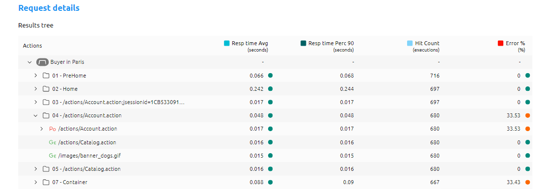
An issue with our reports was that the structure of tables was not saved, so when you open a report again you would have to click through the same steps in order to zoom on some transactions. This also impacted the PDF generation and because of that we now keep the layout consistent over time:
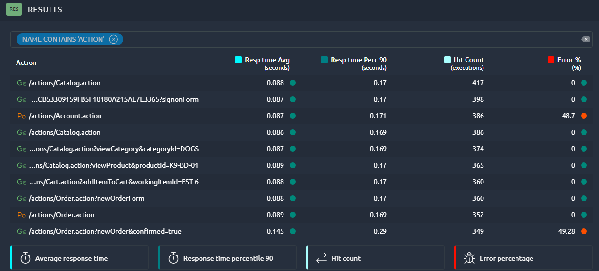
In our next release we will also save the quick filters that you applied to tables, in order to keep the exact same level of information in the printable version and to make sure that anyone that opens a report will see relevant information:
Templates with filters
An annoying thing with our templates was that filters were not preserved over the course of several tests. It is now the case and you can apply the same template to any test you execute:

Multi term filter
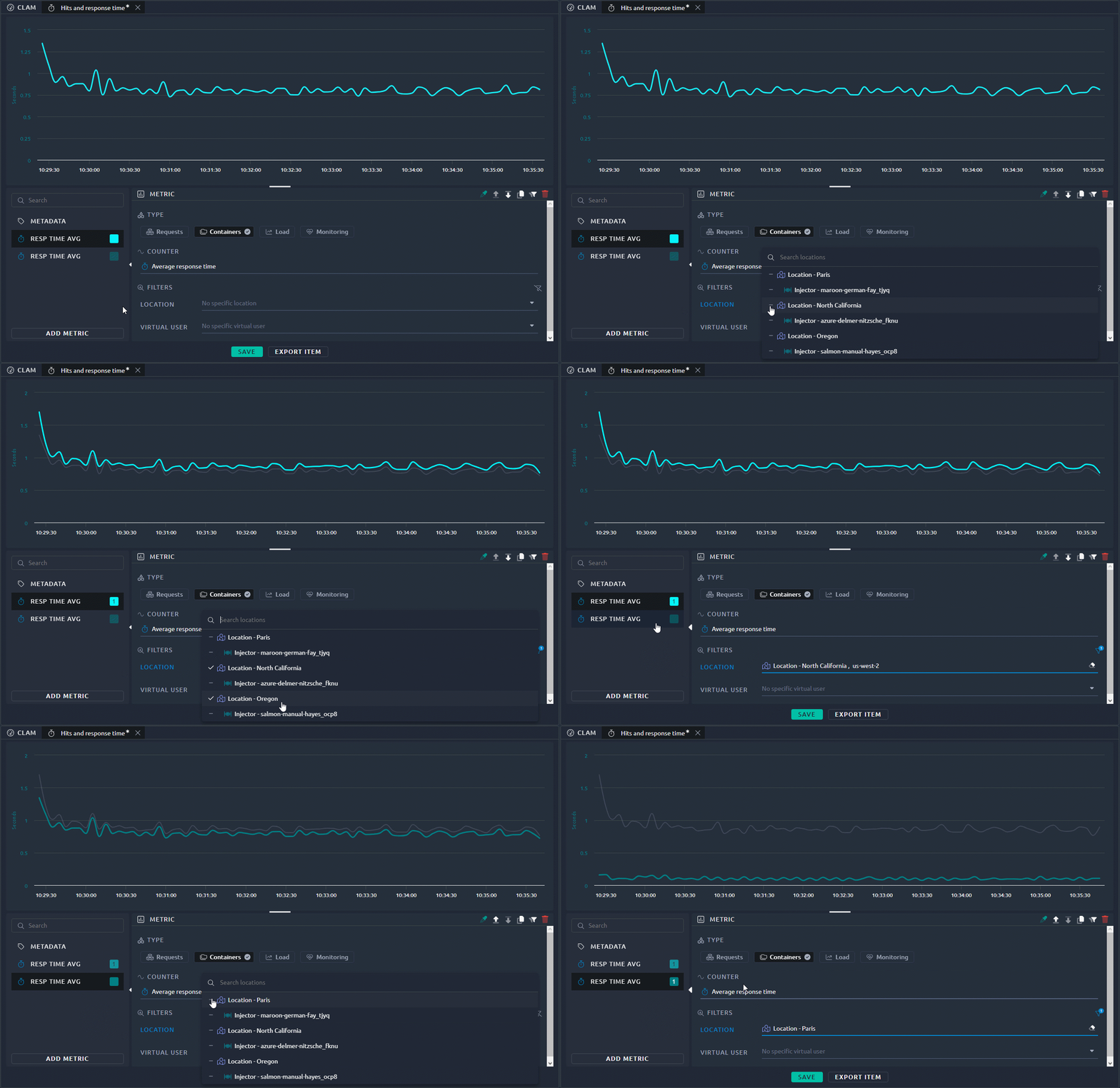
Our advanced filters on graphs only allowed you to select one criteria. But you can now select multiple, for example to filter all the regions in the United States versus the one in France as shown in the example below:
Full changelog
For the complete list of fixed bugs, please refer to OctoPerf 14.4.1 Release Notes.
