OctoPerf's new UI - Runtime changes
This article is the third in a series of overviews of our new UI. You can find the others here:
This time we will dive into the changes we've made in the runtime phase.
Scenario page
The scenario edition page has a new layout, very similar to the design page:

The list of profiles is on the left hand while the currently edited profile will show in the section on the right. As with the design it is possible to edit multiple profiles at once.
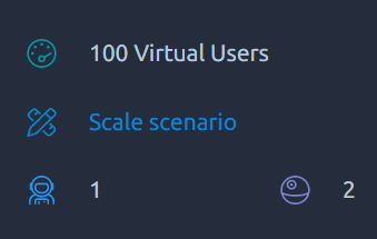
The main page shows useful information about the test and also provides a few shortcuts:
Rescale test

From there you can change the max duration and/or virtual users for this test, we will multiply the values of each profile to reach the new value.
Profile selection
The Stacked profiles graph doubles as a profile selector. Simply hover your mouse on the profile you would like to edit and you will open it for edition:

Edit user profile
Load policy
The load policy edition panel has been entirely reworked:

The curve can be interacted with, in order to add/move/remove points as with the older UI.
But you'll also be able to interact with the list under the graph in order to add/edit a single point more accurately:

Using a mix of both these methods will give a better control over the load curve than ever before.
Panel settings
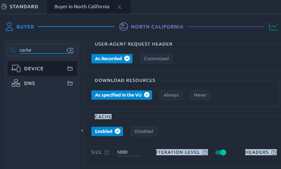
When you're not sure how to find a specific setting, you can now make use of the left handed menu to search:

This menu can also be collapsed in order to save horizontal space.
Launch test
The test launch wizard is rather similar but the layout has been improved to display more information about the test:

It is also possible to one-click schedule the test sometime in the future instead of launching it right away.
Scheduler
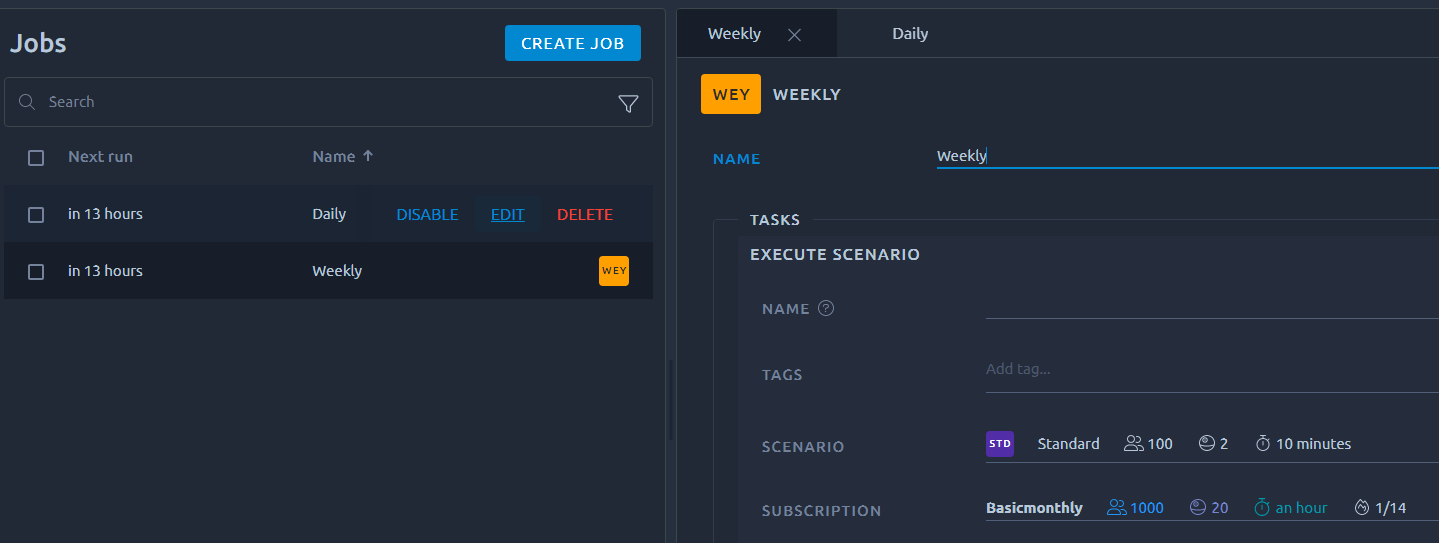
The major improvement of the scheduler is the possibility to edit an existing schedule. It might seem like an easy task but it actually requires some work behind the scene to properly identify and reschedule all the tasks. In any case it is now possible with the new UI of the scheduler:

Conclusion
I hope you can see through these features all the work we've put in the new runtime UI. Of course we'll also improve it even further in the future, once we've released the analysis into the new UI.
In the meantime feel free to share your feedbacks and let us know what you think of the new runtime UI.
