Analyze your load tests
OctoPerf's report engine provides many graphs to sort and presents test metrics in a comprehensive way. We've tried to improve it over the years so that you can access critical information very quickly. But requirements vary from one project to the other.
In this post we will look at how you can configure the report to show your preferred metrics, and also all the shortcuts you can take to achieve this goal.
The best example is the Report summary, it allows you to navigate between all the items in a few clicks:

Of course I should also mention that you can add/edit/remove anything in your report:

Now that the basics are covered, let's move on to the more advanced stuff.
Report items
Line chart
Line charts report items are the most versatile report items available in OctoPerf. Of course you can use them to get an overview of your test, as with the first line chart in the default report:

What may not be obvious when you first encounter a line chart is that every metric displayed can be configured. While this remains true for all the other report items, the line chart is the most versatile of them all.
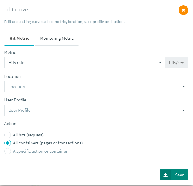
A simple click on the metric Edit/duplicate button, available when you hover your mouse on a metric name under the chart, will open the metric selector:

Here you can select another metric, apply filters, and even select monitoring metrics instead of hits. That means any line chart can be used to compare server metrics with response times or others.
A couple of things to note:
Hitsin OctoPerf always refer to HTTP/S requests number of executions,Hits (CONTAINER)refers to everything BUT HTTPS/S requests. That includes containers, various logic actions and even JMeter plugins you might be using,A specific action or container, the last option at the bottom, becomes available when you filter on aUser Profileabove. This is because we have to know which virtual user you want to see before we show you its tree.
After a bit of work, you can come up with something like this:

As you can see we filtered the response time per cloud location to compare the impact of network and latency on the response time of one particular transaction.
Results tree
The Results tree report item is probably my favorite report item by far. Not only does it gives you details on all the transactions/requests, but it also does it in a structured way:

We can see response time of every element, be it a container or a request, along with percentiles, number of executions (hit rate) and failure rate.
This gives another dimension to the report, not only over time as with line charts, but down in your virtual user tree. Things like going to next iteration on error or loops will be clearly visible since hits count will be lower/higher as you go down the tree. If one transaction has a 100% error rate you can find out right away. This essentially helps you make sure that your virtual users have executed as planned and were not stuck inside a loop for the entire test or waiting for a timeout on one particular step. Otherwise you could have executed only part of the user journey, missing key transactions for your test.
Typically here we can see that the error rate, combined with the error policy Start next VU iteration has a big impact on the hit count:

Top chart
The Top chart report item is probably one of the most underrated item. It is often the first item removed from the report when it is customized.
But it can be incredibly useful in some circumstances. Typically just looking at tables for the highest response times usually does the job just fine, but the Top chart adds a line chart to this, automatically showing the slowest items over time:

Although transaction number 2 is the slowest, we can see immediately when things started to go bad. Which is exactly the kind of information you should be looking for when analyzing bottlenecks.
You could have plotted this on a line chart instead, but it takes time to configure, whereas the Top chart will always be available by default.
Area chart
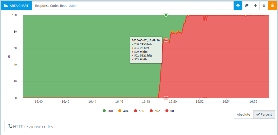
The Area chart report item is the latest addition to our reporting engine. We were not sure about it because it is very sensible to slow Internet connections. If your browser happens to miss an update while the test is running, this graph can look weird. But in the end a simple click on one of the filters under the graph will refresh it and fix any potential issue.
Speaking of filters, you can pick the response codes to be displayed and switch between percentage and absolute views, both have their uses:

The main purpose of this report item is to highlight a change in your application behavior over time. Without it it can be hard to pinpoint errors at a particular moment in time. This kind of behavior is exactly why what we designed it for:

Delta table
The Delta table report item allows you to compare several metrics in one table. It is not present in the default reports since relevant information for comparison is highly dependent on the context. But let's take an example of a test that has been run from two cloud locations:

We can see right away that one zone (Paris) has a much better response time than the other. Also some pages are more heavily impacted than others. That's a very quick and efficient way to highlight network performance issues on various pages of the application.
Comparison
Trending graph
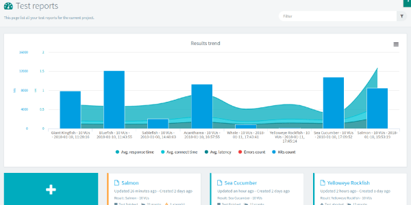
OctoPerf offers two ways of comparing results. the first one is the Trending graph visible on the results page:

This is a very good way to highlight a few key metrics. And it helps you select the report you want to see by highlighting it in the report list:

Comparison report
Obviously when you want details, the trending graph will often not be enough. That is when you can create a Comparison report. Once you've selected up to 4 reports to compare, you will have a reporting page similar to a single test report but with a few additional options.
Comparison Delta table
The delta table will probably be one of the most valuable report items, since it comes with transaction response times from each of the tests:

The percentages of difference are computed from one column to the other (meaning column B compared to A, C compared to B, etc...) and higher response times will be highlighted in orange by default.
Edit labels
One of the things you might want to change are the labels for each test, that way you can have names that improve the overall readability:

In this case there is only 3 reports, so the fourth result label doesn't matter. Note that blocks of text will still have the previous names and you should edit them manually if you want to change this. But all other report items will be updated accordingly.
Result filter
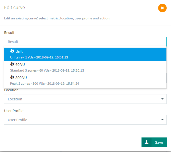
Also, on every report item you can now pick the result from which to get each metric:

This is how you can create your own line charts to compare a particular transaction over several tests for instance:

Templates
Now all we've seen so far is of great help when analyzing data from your tests, but having to do the same configurations every time can quickly become tedious. That's when customizable templates come into play.
The first step toward creating your own template is to configure a report however you like it and save its layout as a template:

After that you can apply this template to any other report and also select it at runtime to automatically be used on all new test runs:

This way you can have relevant information only in your reports. Here's a few examples of typical uses:
- Limit/Focus the amount of information inside the report,
- Show information for requests instead of containers,
- Change percentiles from 90 to 95 or 99.
There are some limitations about templates, typically filters that do not apply across different tests are therefore considered irrelevant and cannot be saved in the template. That includes filters on load agent monitoring, or any other information that is subject to change like a filter on a particular transaction.
Tips
There's a lot more that could be said around what metrics are relevant and what are the usual suspects in some peculiar situations. But this is already covered in our analysis tips and we do our best to keep it up to date with fresh examples as we encounter them.
