Nothing compares to OctoPerf v8
We know it's unhealthy to compare yourself to others.
In particular since it is the time for new year's resolutions and this looks like a good candidate.
There's even a famous quote that states:
But sadly, tests results in OctoPerf won't get this chance. Now you can compare up to 4 test results in OctoPerf! We've also improved our UI again to make a better use of the space available.
Allow me to give you a tour.
Result comparison
The main course is the comparison feature.
If you logged in to your account today, you probably noticed that the result screen is slightly changed.
It is now possible to create a report based on several test results:
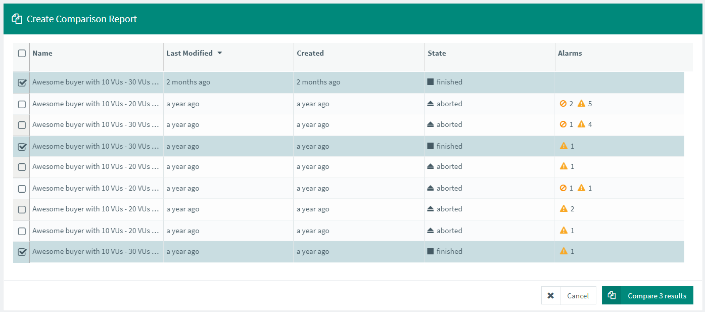
And this will create a comparison report that has a different structure:
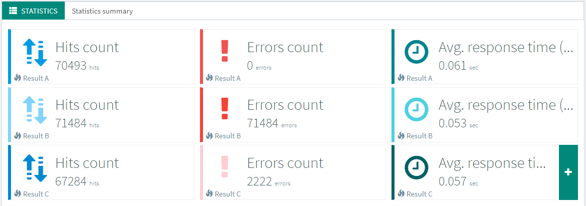
But you will have the same features to configure it to your liking.
For example adding graphs and configuring a specific metric on them:
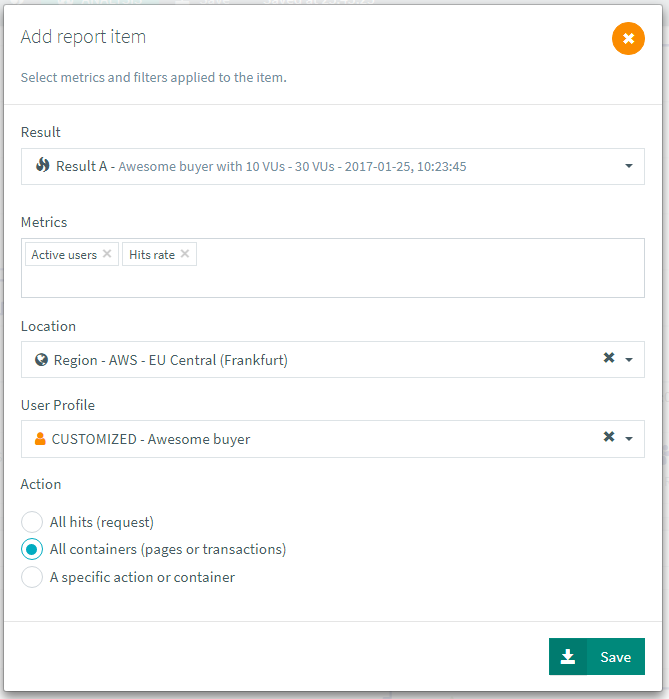
This way you get the same flexibility but with more information on screen.
Delta table
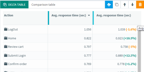
An important addition is the Delta table, a new report item centered around comparison:
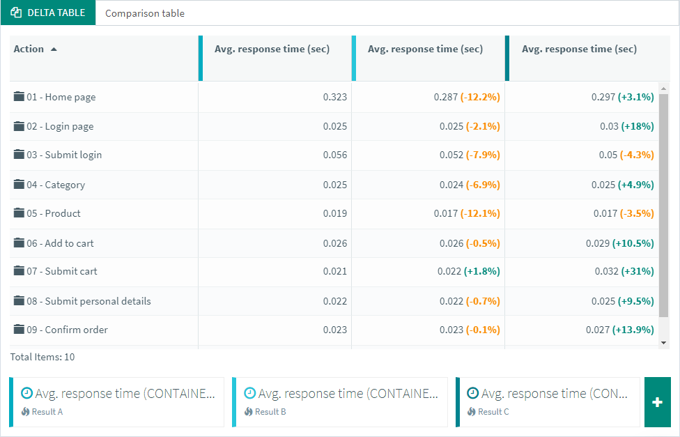
Each column displays a percentage of difference in regards to the one on its left.
That give a good idea of the trend across several tests.
But you can also use it on standard reports to compare response time with latency and connect time:
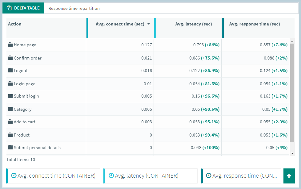
And of course any other user centered metric fits in the table.
Alerts
It was previously difficult to spot a particular test result.
Which is why we've added the trending graph.
It displays a lot of metrics from each selected test.
But there was no information regarding thresholds and alerts.
So we decided to add thresholds to the report card:
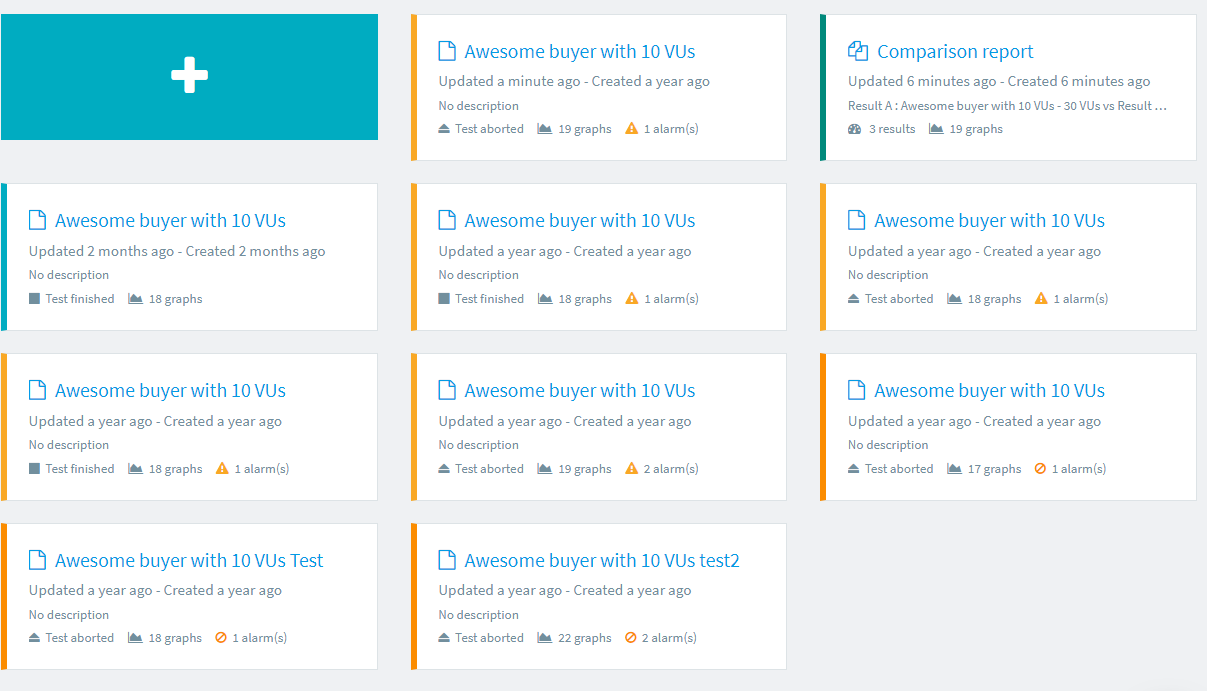
Notice how the color of the report card indicates if there was an alert and its severity.
Report preferences
The new report preferences screen allows you to configure each report.
You can edit a number of preferences, like the max metrics per graph type and alert colors:
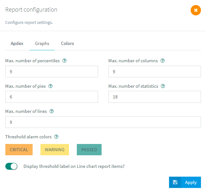
Also it allows you to configure the set of colors for each graph:
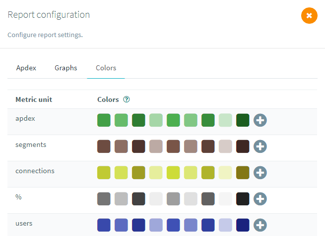
This is a good way to customize all graphs to your liking. These color sets can be saved and it is possible to switch from one to another.
New layout
We're always trying to render OctoPerf as usable as possible. Which means making good use of the space available. The right panel was added a while back on the design screen and a few months ago on the report. It contains essential information and features but it's also a lot of wasted space on the bottom right of each screen. Also on lower screen resolutions and small screens, it would make the rest smaller. You can always collapse it but that requires user interaction every time.
So instead we've worked on a new layout.
Each feature from the right panel is now in a window of it's own that you can display by hovering the mouse:
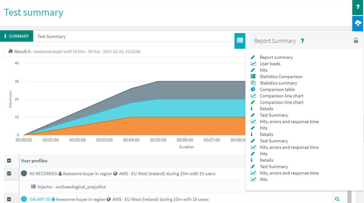 Some of them can be locked on screen, others just naturally come and go.
And this way, no on screen space is wasted anymore.
Documentation update
We are always working to provide the best solution possible. But without proper documentation OctoPerf will take more time to master. And our objective is to make this experience as smooth as possible.
Which is why we now have a dedicated page for each concept, with examples:
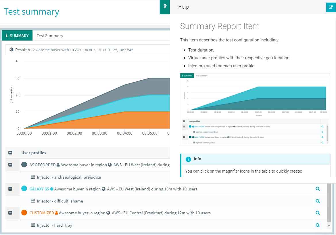
Feel free to check it out, even if you think you know everything about OctoPerf, you might learn a few things.
Amazon Paris
As a french company we were frustrated to not provide a Cloud zone in France. But recently AWS opened a new datacenter near Paris, so we enabled it in OctoPerf.

This way you can run a true "Test de performance" and release our kraken on the eiffel tower!
Elastic search 6.1
And as usual we updated to the latest version of Elastic Search. Although this time I'd like to take more time to explain since elasticsearch 6 brings a lot of changes. You can see them in the changelog.

Thanks to this new version, access to data will be even faster than before. Also the storage space required is lower, which allows us to retain your data for a longer time. The only drawback is the need to go through a database migration for our on premise users. It is a simple procedure available from our documentation.
Conclusion
As it is the first update of 2018, we wanted to set the bar pretty high. We hope you will like OctoPerf 8. Feel free to share your impressions through linkedIn and twitter.
And as always, keep sending us your feature requests! It's not that we're running out of them but the more we get, the better product we can build.
